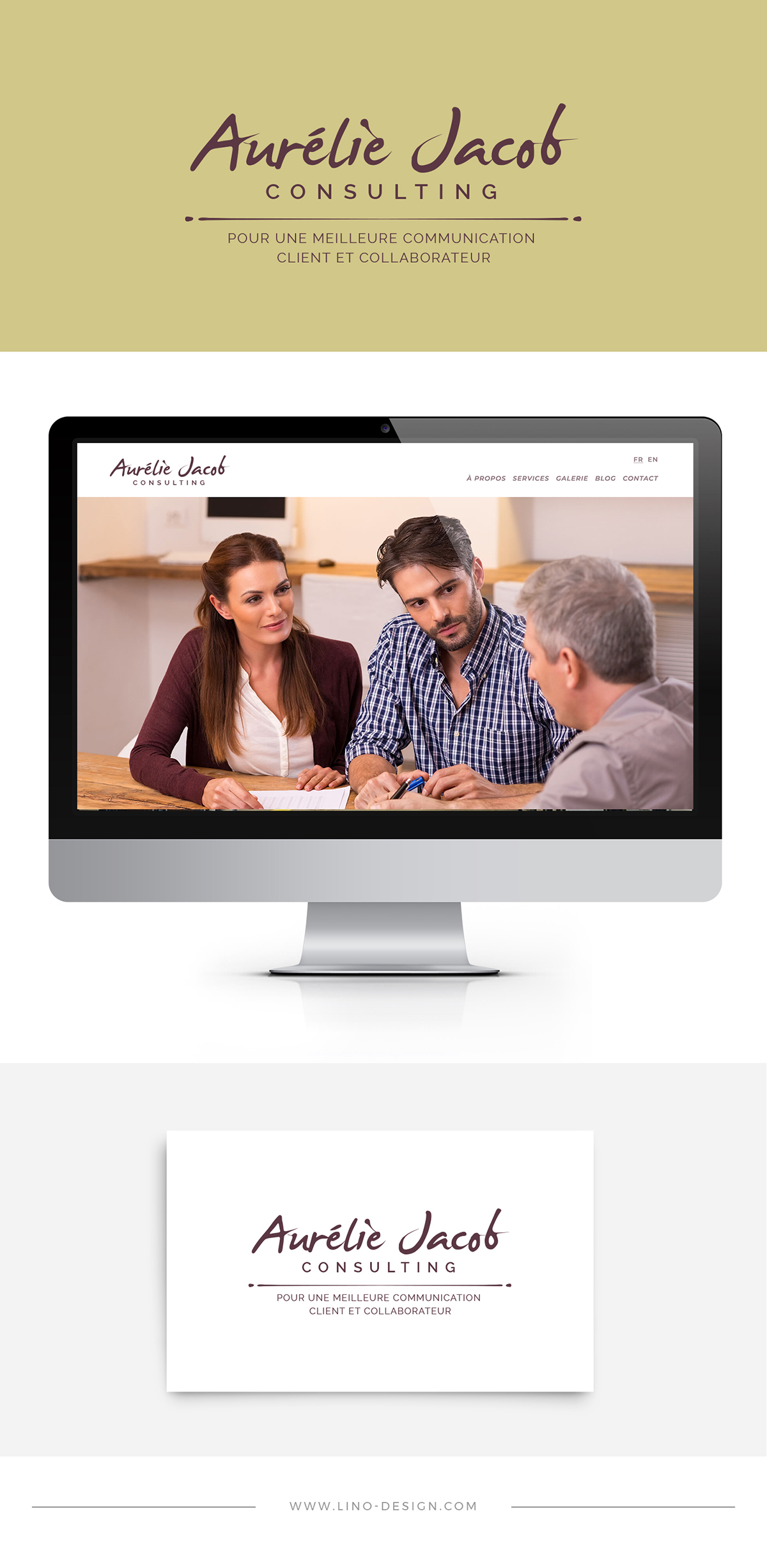
Aurélie Jacob Logotype
Logotype
After several years working for other companies, Aurélie Jacob launches its own project of accompanying companies in the resolution of conflicts between clients and employees.
To represent this independent activity, we chose to highlight the name of Aurélie through strong and lively typography, without resorting to unnecessary graphic forms that would overwhelm the logo.
The separation line, punctuated by two small circular shapes on each side, symbolizes the fluidity of easy and successful communication. The manual handling of the line, as well as the use of a typographic script, reveals a human and empathetic aspect.
Li-Nó Design supported the project in the following tasks:
- Main and alternative logo design
- Setting the color palette
SHARE IT!